vincecate wrote:John wrote:John wrote:I guess that's what "going parabolic" means.
Dow up 150 points.
This just has to be in the crazy "going parabolic", "melt up", or "blow off". I just can't imagine this going too much longer, but I never thought it would go this long, so I just don't know.
I think we are due for a crash.
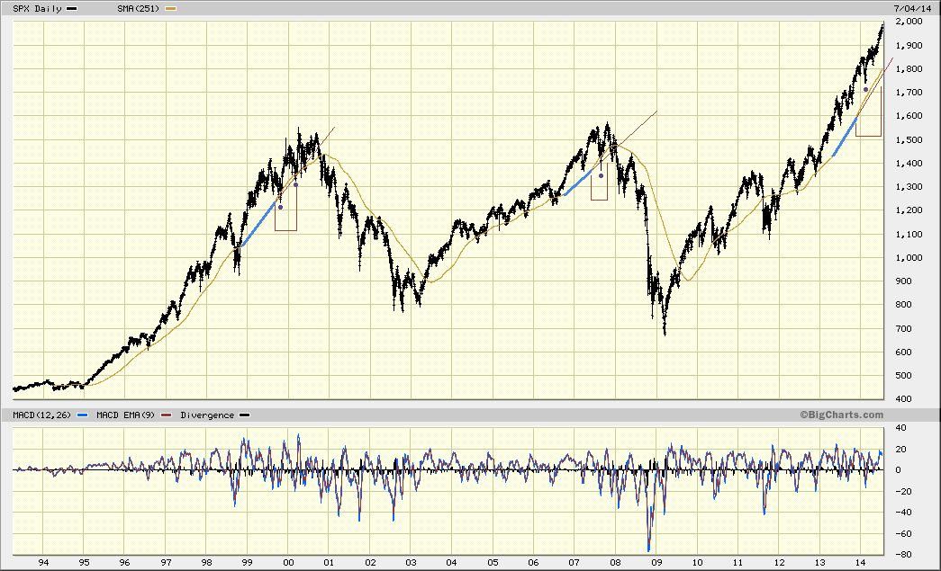
On this chart there are 4 things:
The gold line is the 251 day (approximately 1 year) moving average.
The blue line shows the area of the bubble where the year over year growth rate is steady (or a straight line).
The red bracketed areas show where the year over year growth rate accelerates into an unsustainable trajectory and is "going parabolic".
The purple dots show where, once the bubble is going parabolic, it gets bumpy.
- 251DMA.gif (48.1 KiB) Viewed 4133 times
On the above chart, let's measure some data points. The numerical values will be recorded for each of the bubbles (2000, 2007, 2014).
Once the year over year moving average started going parabolic, how far did the bubble move over that point? (Example - Bubble starts going parabolic in 1999 with the moving average at 1230, bubble gets to 1550.) 320, 210, 390.
How far did the bubble move from the low of the first bump? 320, 210, 250.
How long did it take for the bubble to reach its maximum once it went parabolic? 7 months, 4 months, 8 months.
How far did the moving average rise (blue section) during the steady year over year growth phase of the bubble? 180, 110, 160.
How far did the bubble move from the start of the steady year over year growth rate of the bubble (beginning of the blue line)? 480, 310, 560.
While the periphery breaks down rather slowly at first, the capital cities of the hegemon should collapse suddenly and violently.