These 2 charts show the details of the similar movement in the 6 weeks before the 1929 crash compared with the 6 weeks before today.
The 2 dojis are the 2 little red bars that look like pins.
It looks like there was a deliberate stock market manipulation after the first Fed announcement of QE tapering on December 18 which was designed to prevent a crash from getting started. Either that, or the positive seasonal period and perhaps a little boost by the Fed got investors in a jovial holiday mood.
Since 1929 was a long time ago, I prefer to look more closely at nearby periods such as the period before the flash crash, posted last weekend, for more exact comparisons. That still seems to be a match to the recent activity.
Though I think the match to 1929 is very good considering that it was 84 years ago. Even if a lot of other conditions change, human nature doesn't, and I think that is what this comparison shows.
As an alternative to an imminent crash within the next few days, this may be showing that there are cracks in the market that might show up later, maybe few weeks from now. But I'm not betting on it just yet.
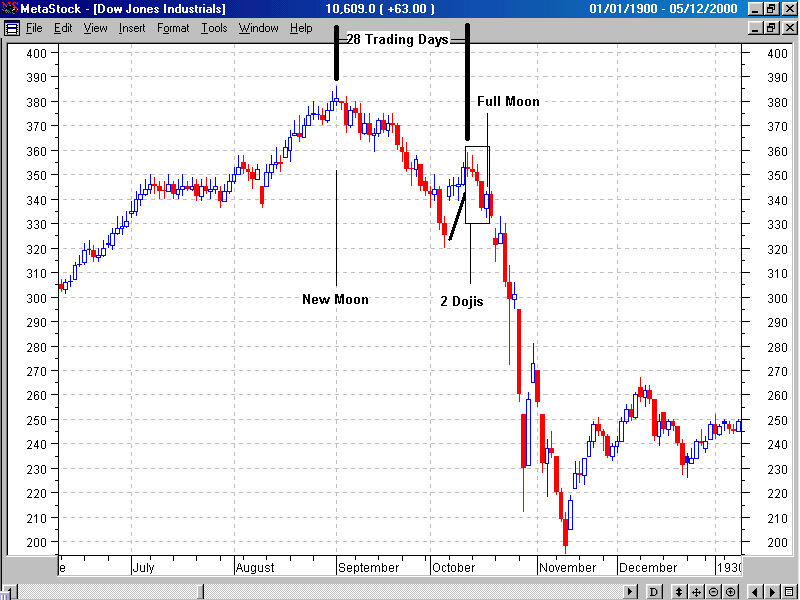
- 1929_dOW_CRASH.gif (25.99 KiB) Viewed 3114 times
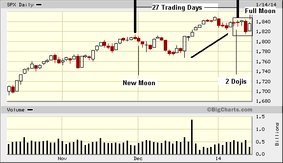
- TODAY.gif (11.46 KiB) Viewed 3114 times
While the periphery breaks down rather slowly at first, the capital cities of the hegemon should collapse suddenly and violently.